Projects

Slovenian news with a new, modern web look

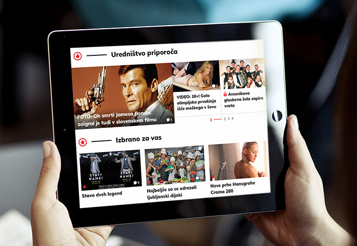
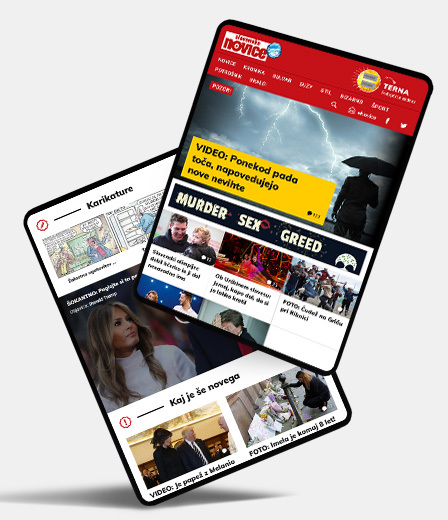
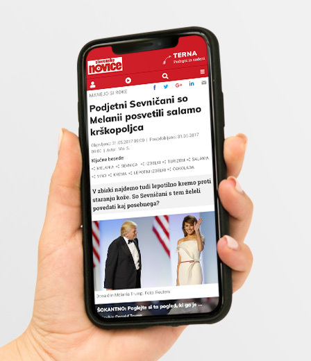
Slovenian news brings more news, more video, more pictures and more fun online with a new website!

Slovenske novice
Client
Newspaper house Delo
Area of operation
Media and publishing
Year
2018
Services

Developing the user experience
User journey planning
User experience and functionality design
Design of graphical interfaces

Visit the site
Client

The media house Delo has a 60-year tradition. In this time, Delo has become one of the leading and most influential companies on the Slovenian media market. Through professional work and adherence to the highest standards, they have managed to gain the trust of readers and advertisers, which represents their greatest value.

Slovenian news is one of the most widely read and popular online and print media platforms in Slovenia. On their website, users can find a wide variety of news, ranging from current affairs at home and abroad to entertainment and sports content. With an emphasis on fast and high-quality news content and attractive photographs, Slovenian news offers a fresh and varied insight into what is happening at home and around the world.

Challenge

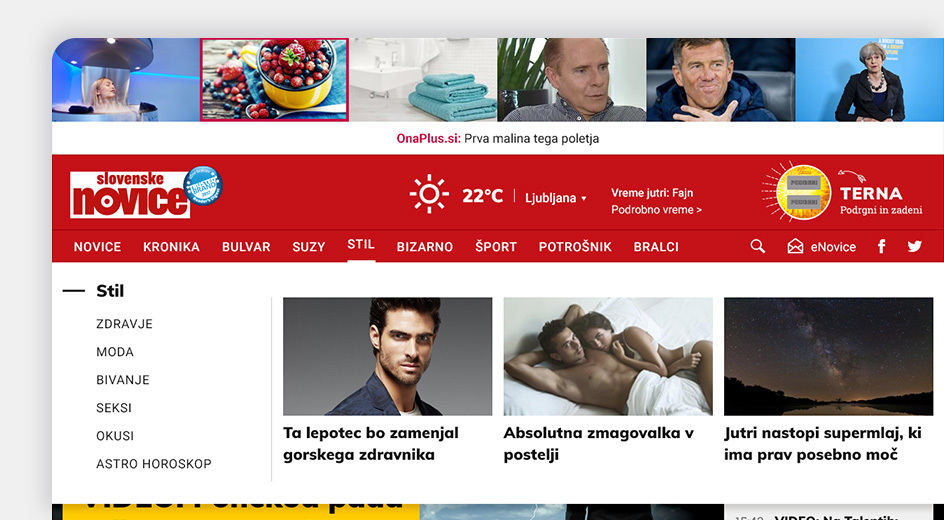
The Slovenian news website needed a facelift and an improved user experience. The complex structure and numerous categories required better navigation to give readers easy access to the content. In addition, it was crucial to give the editorial team more options to highlight articles and content on the site.

Solution

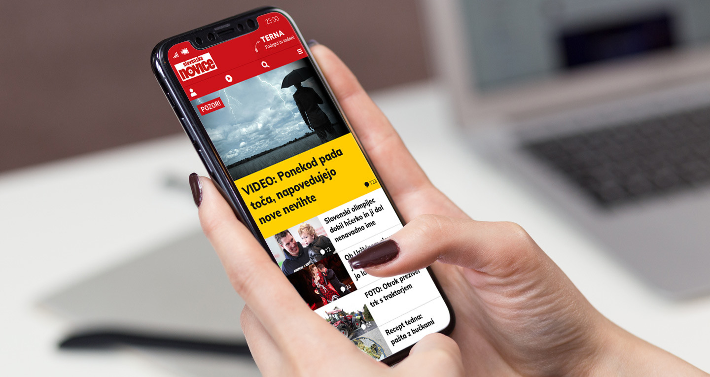
We focused on developing a good user experience and came up with a concept for a redesigned interface. We developed a navigation system with a two-level menu that allowed for greater clarity and highlighting of additional categories according to topicality.

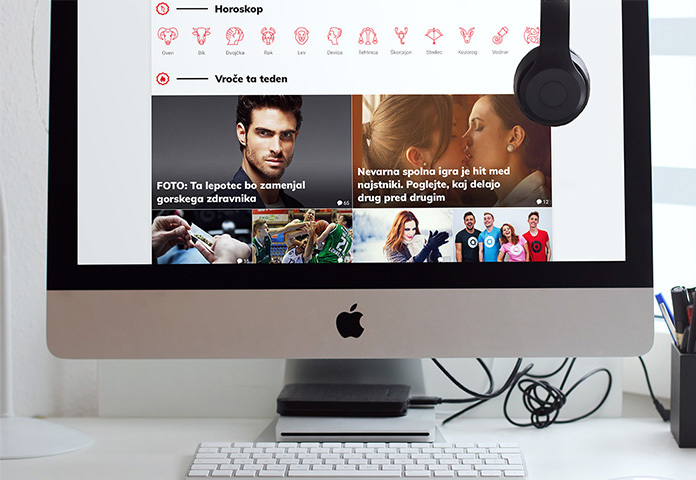
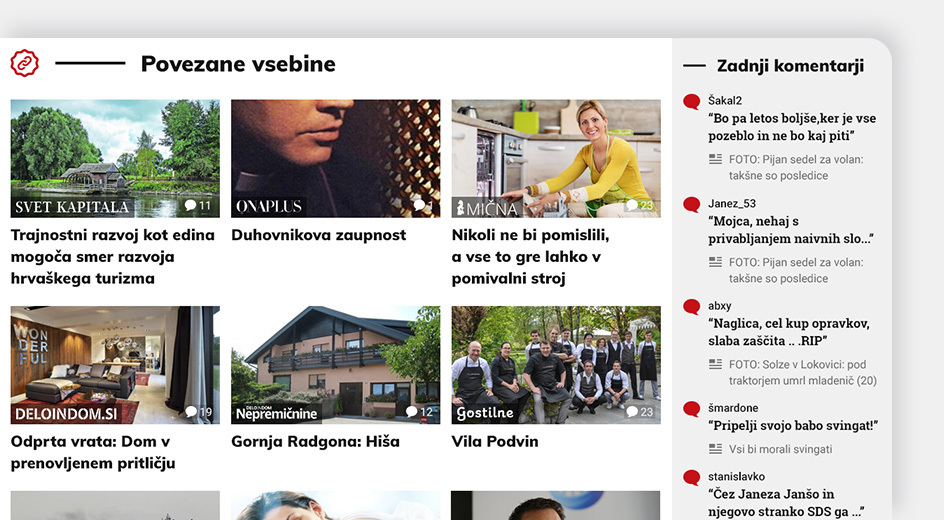
The graphical interface was developed responsively for user-friendliness on different devices. We also integrated content and news from related portals such as Ona Plus, Delo in Dom, Kapital, etc. In this way, we have improved the readership and traffic of articles on both pages.

Results

The redesign made the Slovenian news website more user-friendly and up-to-date, which improved the user experience for readers. The editorial team was pleased with more options to highlight articles, which enhanced the readability, attractiveness and clarity of the site. We have reorganised the article locking system and optimised the ways in which we lease access.

The website is scalable and responsive, which has increased accessibility for readers on different devices. It offers advertisers more advertising zones, allowing better results when marketing ad space.

+20 %
Longer time spent on the page
+30 %
More daily access leases
+15 %
Increased readership of linked portals

See also

Simbio phone EN

Simbio with AI Chat

Integration of ChatGPT AI Chat on the Simbio Website

The overall visual identity of WB3C

New identity for the Western Balkans Cyber Capacity Center.

All projects

EmporijGPT AI

Your smart chatbot for everything you want to know about us or our work.

Start a conversation